I have never professed to be a fantastic copywriter. I am more of a creative writer. I realized that long ago. Yet I have spent enough time online to pick up a couple of “good habits” that have made become a more intuitive marketer. One is how to increase your sales page conversion in 3 minutes flat!
FIRST
While I love pretty things (handbags, flowers, jewelry), that is NOT what works online. I have battled with clients over this while helping them build article blogs. Many of the clients I work with want pretty, when in reality some not so pretty things work really well online to convert prospects into sales.
SECOND
Testing this theory out over and over has made me a believer. Do you test? If you are just starting out online, you probably don’t. I know I didn’t at first. I spent so much time trying to finish one thing, I didn’t have the energy or the inclination to test another thing out to compare and contrast. But as I grew more comfortable with my niche, what I was teaching, what I was writing – I began to test. Testing sales pages, Landing pages. Emails. Etc. And one of the things that I have discovered through testing is something that can increase your sales page conversion simply by…
Changing Your Order Button.
I FEEL PRETTY…
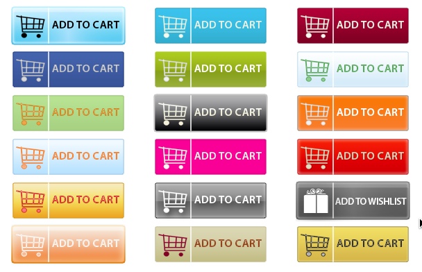
These are an example of “pretty” add to cart buttons that I would have liked to use:
TESTING PRETTY VS. WHAT WORKS
When I first launched my article marketing training course and membership site (Articology), my sales page contained a simple link to the order page. Later I added a “sign up” graphic. I used both on the sales page and sales increased. I made the graphic bigger and I saw a little improvement.
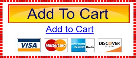
Finally, after taking a look at some of the sites that I had recently ordered from, I noticed that many were using a bigger button. Many were using “add to cart” instead of order now or subscribe now or sign up. They were using an orange color for the button, and a few were using red dashed lines around the perimeter. Something I wouldn’t have normally used. But this is the type of button that ultimately increased conversion on my sales page by 35%.
You will find buttons like this on sales pages of products and services that you buy from and that convert well in places like Clickbank, etc. You can easily create it in photoshop (that’s what I did), or you can find one you like and swipe it:) The advantage of creating it in photoshop is that you can add a little bit of type which shows the regular price and the discounted price for each of your products. This has been proven to help conversion as well. Something that looks like this:
SO WHAT NEXT?
I recommend that you begin to test your current sales page and order button vs. a duplicate sales page with the big ole’ orange button and see how your conversion compares. You can test sales pages a variety of ways. Switch out your order buttons with one that looks like this and watch your sales and conversion improve!
If you’re just starting out and selling your first product or promoting your first service, then I recommend to go with the big ole’ ugly orange button for now and test later.
As a few people in the comments section mentioned, this high converting button is called The Belcher Button and you can grab a copy to edit for your own site over on the site at: http://www.belcherbutton.com/
Lisa Angelettie
Latest posts by Lisa Angelettie (see all)
- Back Matter 101: How To Add Killer Call To Actions To Your Books - August 3, 2015
- Shelfari Is No Longer An Option In Author Central - July 28, 2015
- What Are The Most Well-Read Cities In America? - June 2, 2015


Lisa,
Great advice!
Jim Hageman
Very interest Lisa, thank you.
That’s called in Internet Marketing an “Belcher Button”, because was made by Perry Belcher after a long way of researches. Do a quick search on Google or YouTube and you’ll see WHY it is converting so well. It has to do with the colours and instincts awaken by this colours and shapes.
I’ve been using “Perry Belcher Button” for a few months now. Hard to believe that a simple change of design of a ‘buy now’ button can have such a positive effect on conversions – but it does.