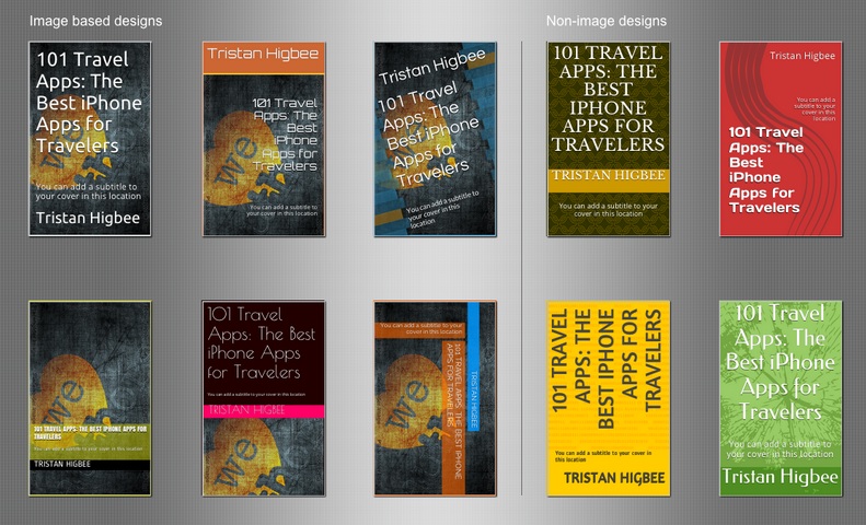
I read quite a lot of articles every week on ePublishing, but I think this is one of the best articles I’ve read on how to design a book cover that sways readers into buying your books. I found it over on Creativindie.com and it’s written by Derek Murphy. Check out this snippet on crafting clever covers for non-fiction books… 

“Here’s a quick rule of thumb: non-fiction appeals to the brain. You want an instantly clever image to catch their mental attention. Non-fiction covers should have a central “gimmick” and a solid color background or gradient (orange and yellow are very popular for business books. (BTW, notice how wide the spacing is between the letters on these two covers). You catch the brain’s attention by showing a juxtaposition — things that shouldn’t really go together and are unexpected. Then the subtitle tells them what the book is about.”
I really liked some of the tips he gave on letter spacing, selecting fonts, color contrast, and adding a blurb on the cover of your book. Read the article in it’s entirety here: http://www.creativindie.com/8-cover-design-secrets-publishers-use-to-manipulate-readers-into-buying-books/ Let me know if you learned anything cool!
